Jon Hall
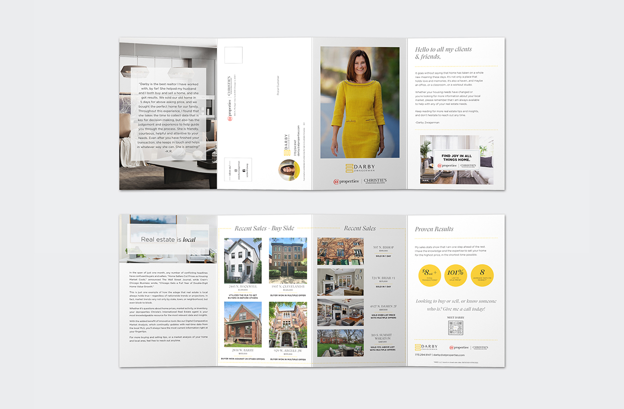
This gatefold highlights a real estate brokers information. This is a heavily modified template, the layout and graphics were all updated or customized. Working one on one with the broker we were able to discuss and achieve the exact look and layout they wanted to achieve.
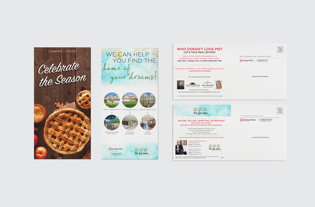
These front facing vertical postcards are completly custom and part of a monthly mailer program. The clients provided an idea of what they wanted. All graphics, layouts and photography were all selected and arragned based of the clients idea. Working one on one with them we were able to discuss and achieve the exact look and layout they wanted to achieve.
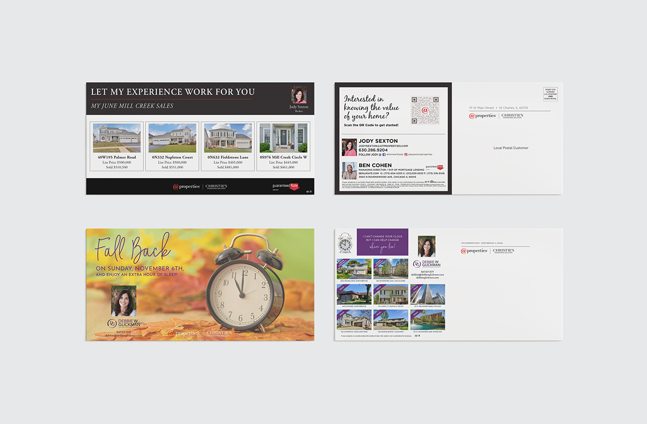
These postcards are completly custom. The clients provided an idea of what they wanted. All graphics, layouts and photography were all selected and arragned based of the clients idea. Working one on one with them we were able to discuss and achieve the exact look and layout they wanted to achieve.
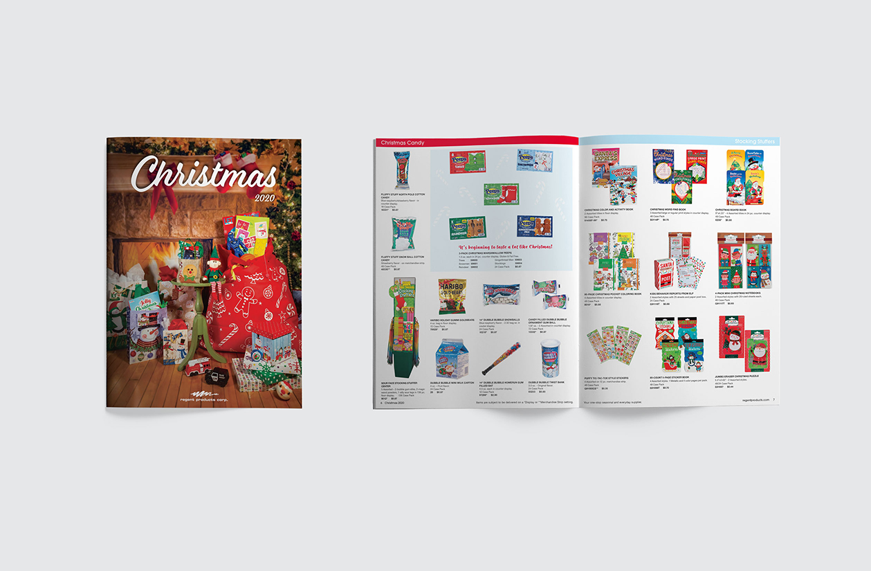
Regents 2020 Christmas catalog was designed using a basic grid system. The different catagories of products are color coded. Graphcis and slogans were also made. This project was time sensative and required working directly with the sales team, photographer and print company.
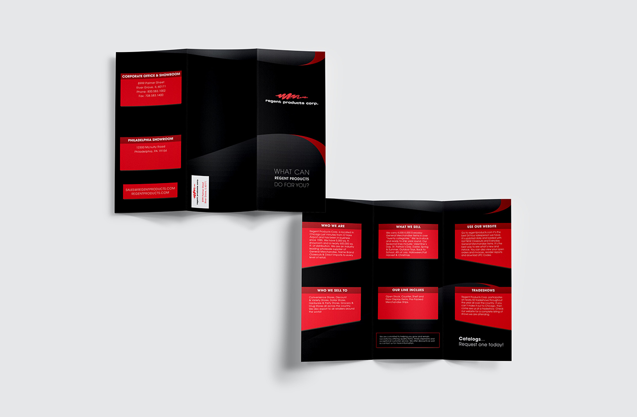
A update of Regent Products general information brochure. The red shapes that contain text mimic a product display, which many of Regent's products use. The gradient shape used in the background is inspirired by the shape used in Regent Products logo.
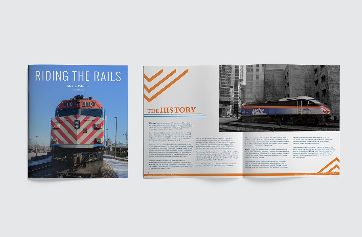
Riding The Rails is a informative magazine on the Chicago Metra train system. It's in a basic two column grid format. The graphics resemble the front of Metra's locomotive trains. The use of Metra's colors, blue and orange, are also shown in the typography.
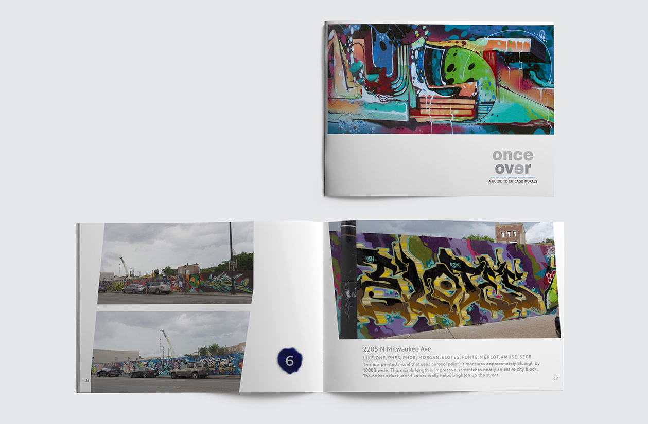
Once Over is a guide for seeking out street art locations in the city of Chicago. The type is grey so that it doesn't distract from the colorful images. The graphics used were inspiried by or created with spray paint. To compliment the aggressiveness of street art, the images are cut on an angle.
